|
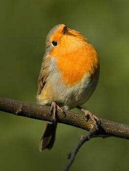
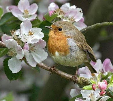
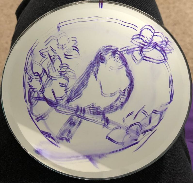
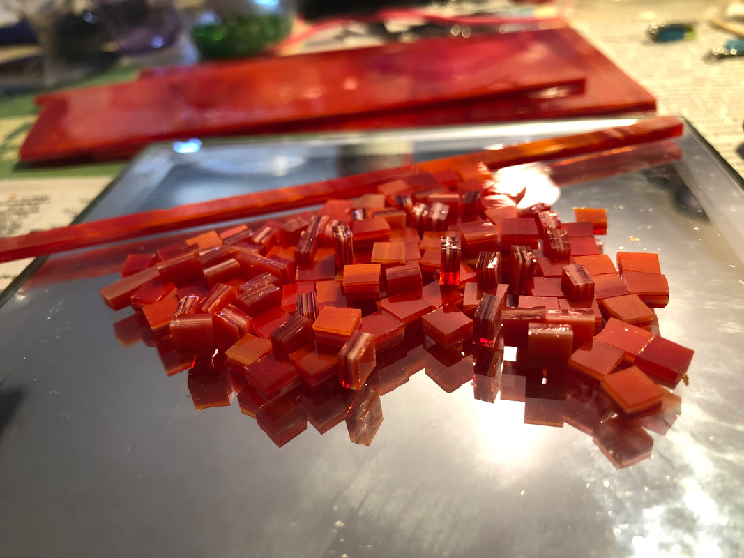
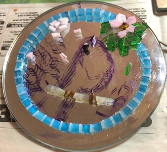
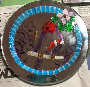
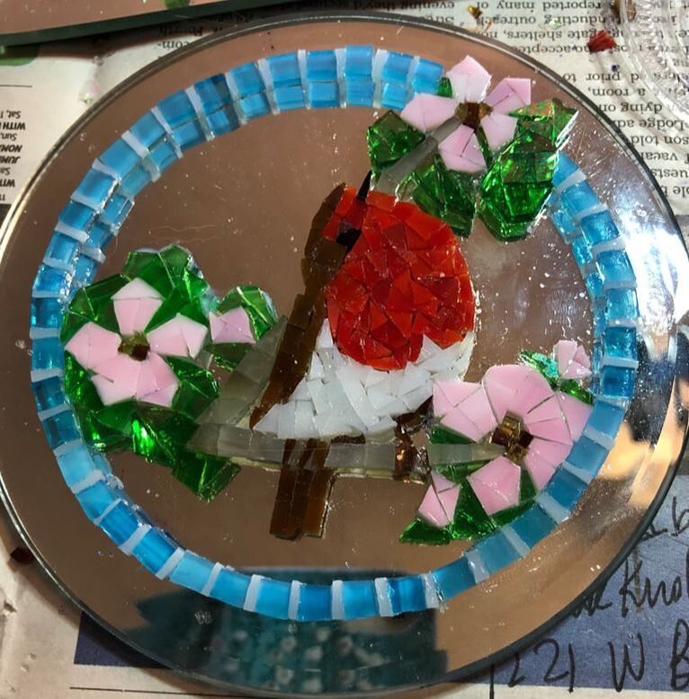
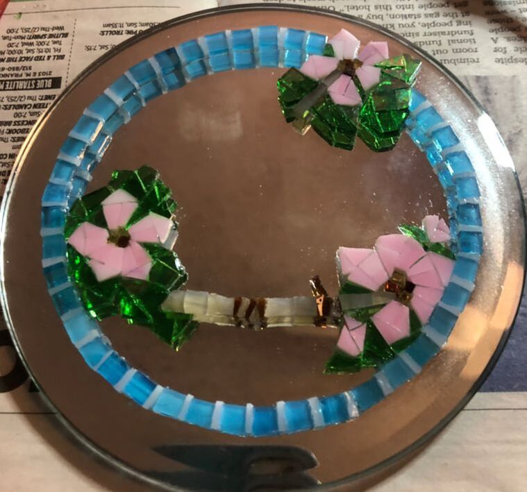
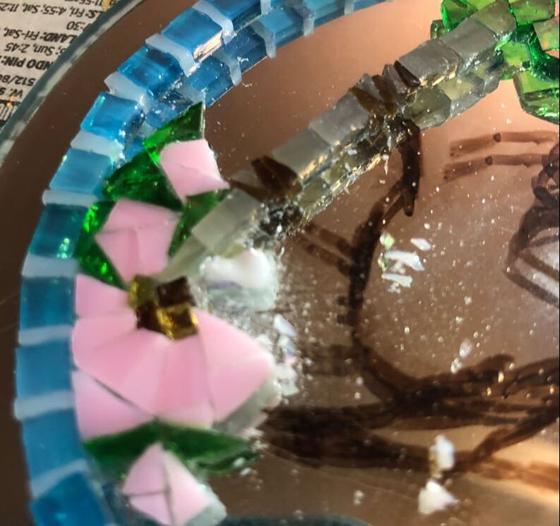
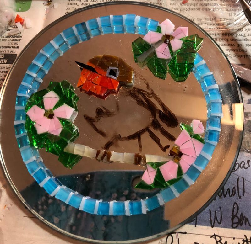
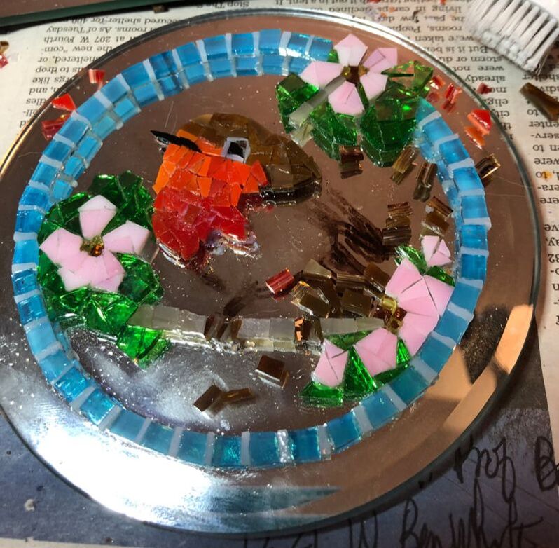
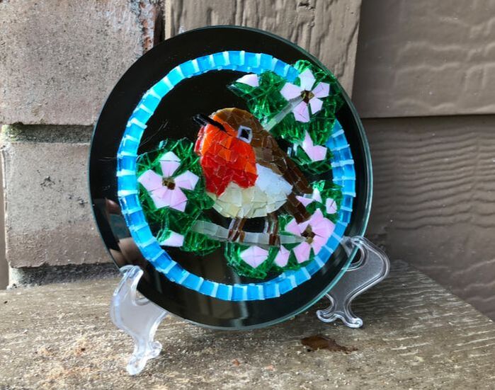
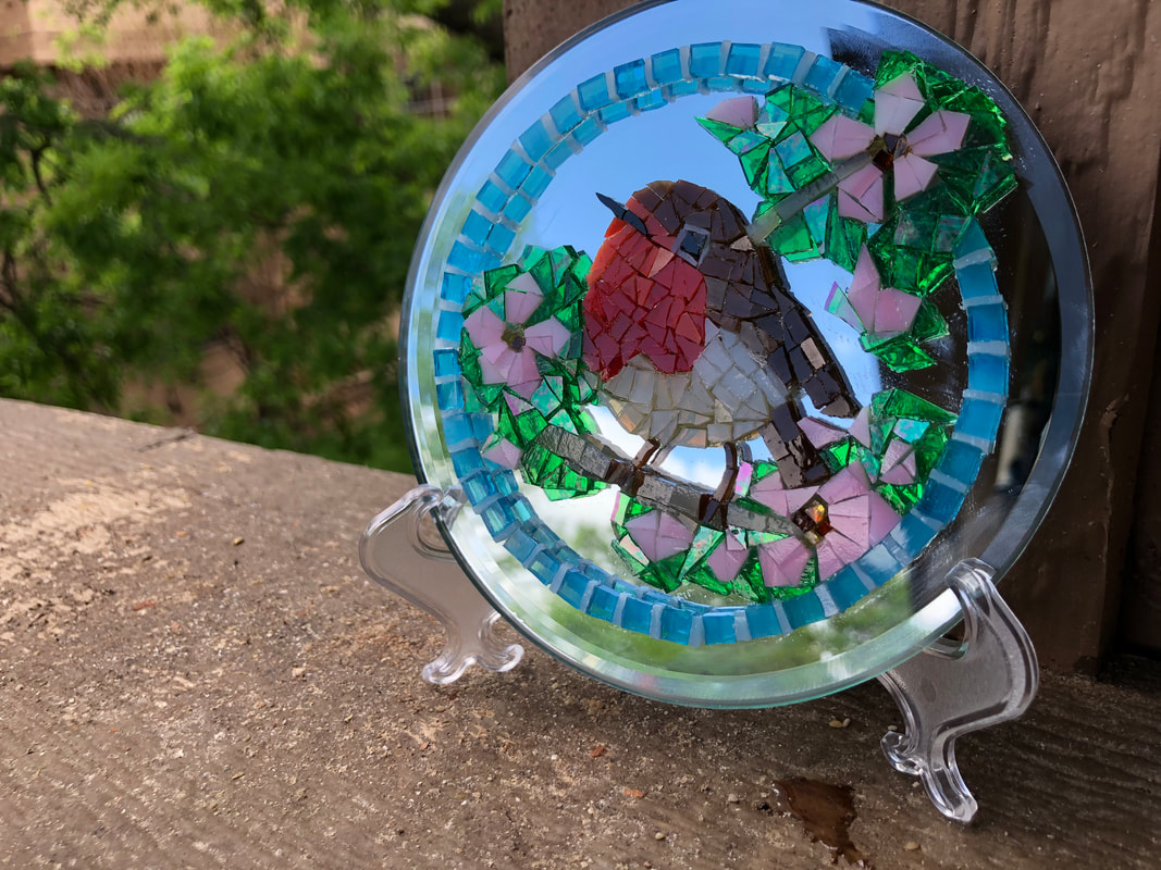
I have an English friend who always sends Christmas cards with robins--English robins, not our bigger, less adorable American robin. I wanted to make a mosaic for her and thus picking an English robin seemed right. So I started looking at photos of robins. I liked the cheekiness of the robin with the cocked head, but wanted the flowers that appear in the second photo. I decided to combine both in my sketch. I thought this should work fine and thus turned my attention to cutting the new red glass which I had bought. I liked that this red was really a mix of red and orange as well as other shades in between. That would be important for getting the colors right on the little robin redbreast. 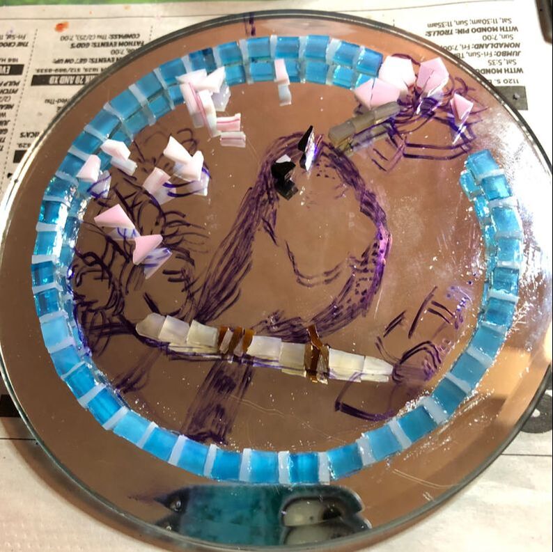 For the border I settled on light blue and white to represent the sky. I left an opening at the top right to have the flowers break through the frame. I decided to put in that first flower in the gap, followed by beginning the head. I confess in my eagerness to just get on with it I had forgotten that I was going to sort out my different shades of red to make the coloring look more realistic. But more on that in a moment. Once I finished the robin and added a couple more flowers and buds, I decided I didn't like him. It was flat looking and didn't look like feathers. Unless you knew where the face was it was difficult to see. The shading was all wrong (or absent). Plus he no longer seemed centered but more on the right hand portion of the mosaic. I had some choices. I could scrap it altogether, or I could just remove this robin and redraw/recenter it. In the Roman world there is a process for removing a leader who has fallen out of favor from public monuments: damnatio memoriae. A person's image or his name (or both) would be removed -- totally chipped away. And thus I removed this robin and even some of the flower. The glue that I use, Mac Glue (a craft glue), had fully set and I was amused to see that some of the glass broke instead of the glue giving way. Eventually I got everything cleared off. I decided to draw the other robin because I thought he would fill the space in a more balanced way. I was mindful of the shades of red and orange for his face and chest, making myself redo any section that wasn't fitting together quite right. I'm still not 100% satisfied with my robin, but the coloring and shading is better, and the balance of the piece is definitely improved. I added more greenery and pink blossoms, petals, & buds. I do think he is lovely in the sun and I am pleased that I never gave up on him.
0 Comments
|
AuthorRamblings of a retired Latin teacher, creative creature, and general person rediscovering life after teaching. Archives
August 2023
Categories |
 RSS Feed
