|
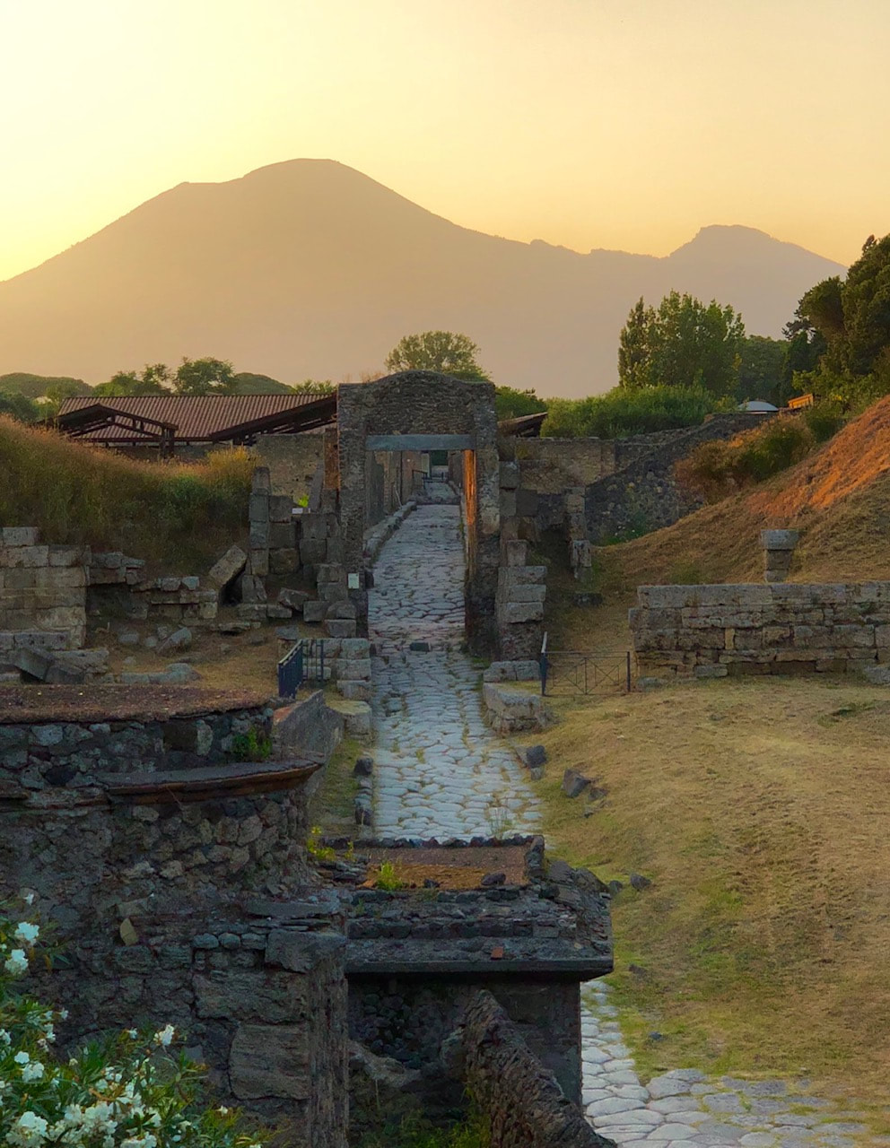
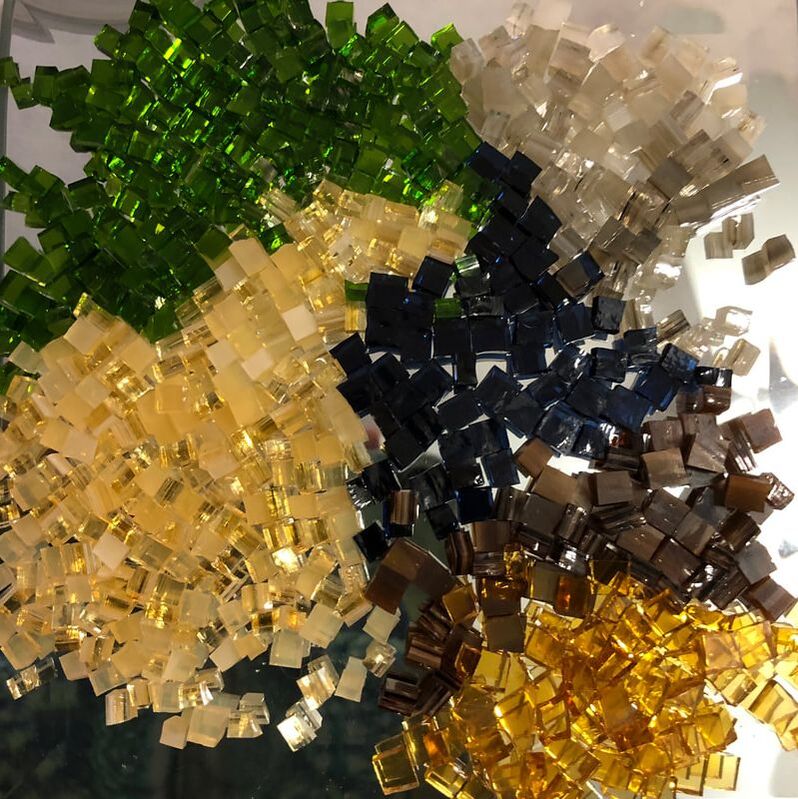
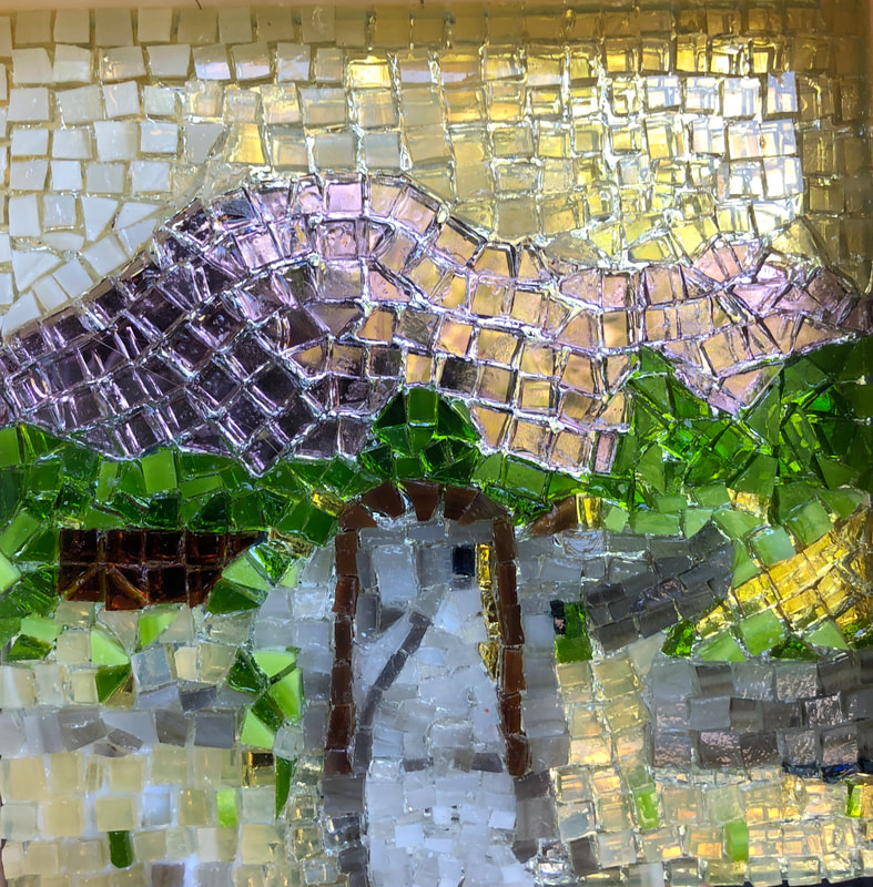
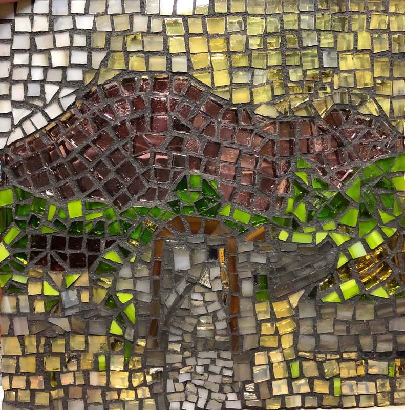
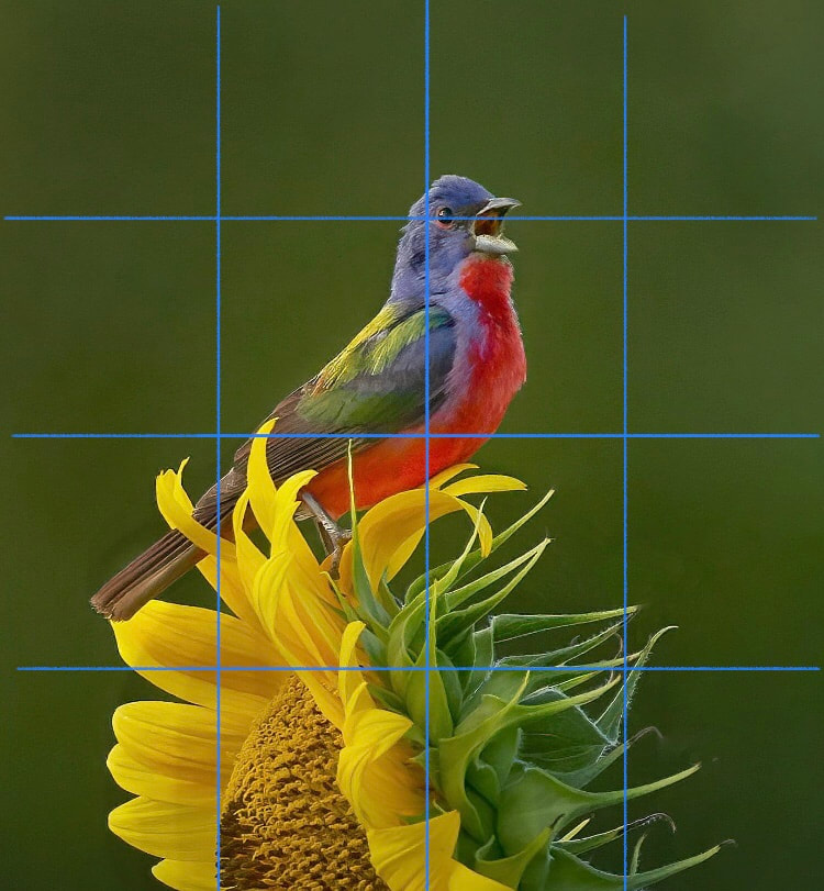
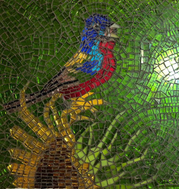
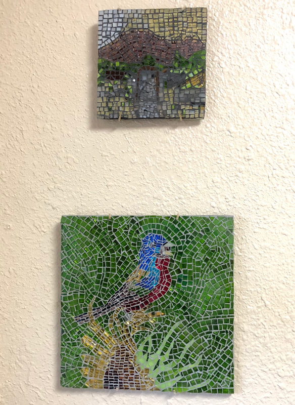
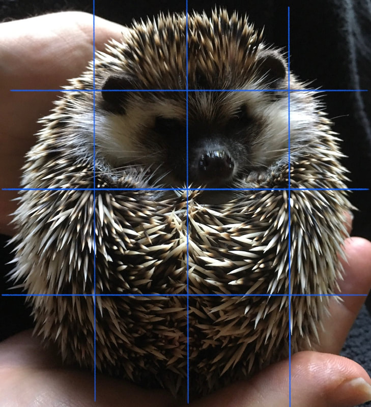
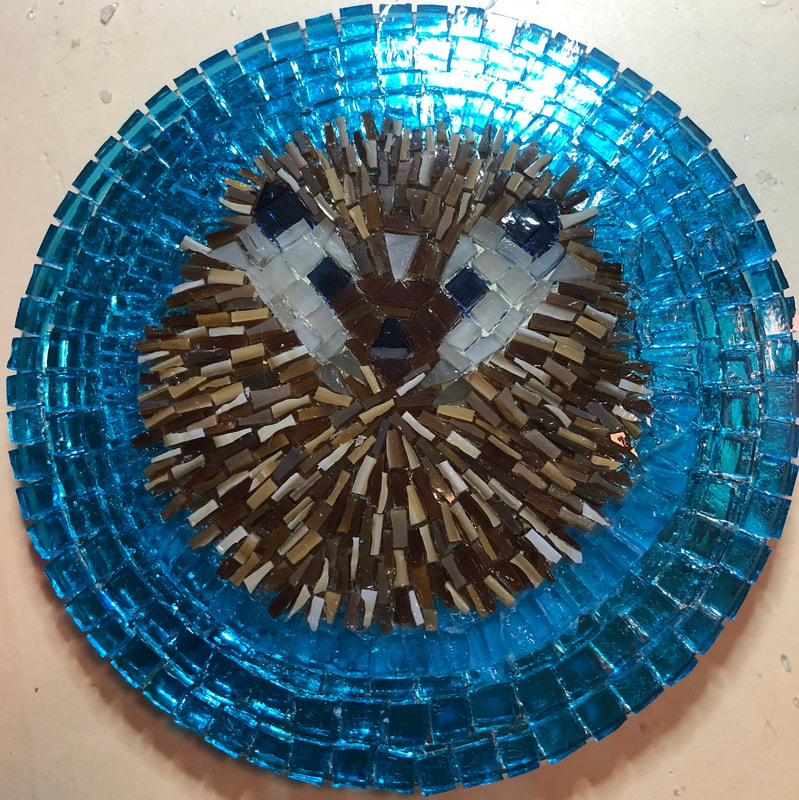
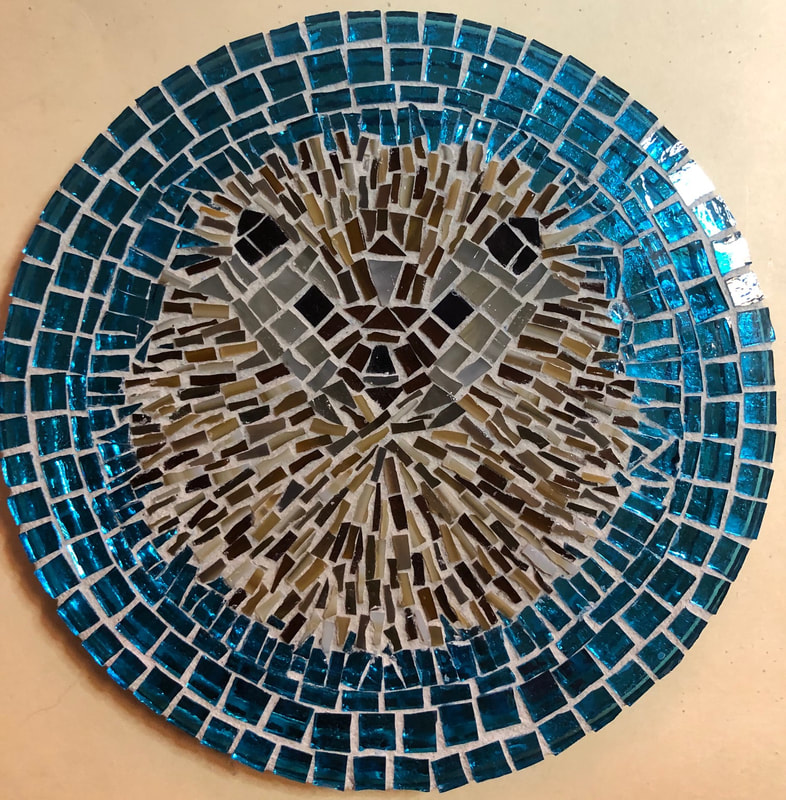
I had this idea that with retirement would come art classes and workshops and new people. But of course because of Covid19, we are all doing things differently. So I have struck out on my own with making mosaics. My first mosaic was based on a photo of Pompeii, taken by the wonderful Prof. Sophie Hay. I liked the warm light of an early morning over the ruins with, to me, the focus on the road leading in. Looking at this photo even now, I get tingles and want to walk down that road and enter that amazing little town from another lifetime. I'm sure there are ghosts of ancestors there who would speak to me. For some reason, perhaps in my quest to try to do something interesting with light, I picked this photo for my first project. With generous retirement gift cards in hand (and a mask), I headed to Blue Moon Glass to purchase tools and glass. Glass isn't cheap, but it is pretty, especially once you start cutting it up into 1/4 inch size tesserae or smaller. There was and is something oddly therapeutic just cutting up the glass and making pretty piles of gems... I purchased some small square and round mirrors to use as a base. For my first endeavor, I grabbed one of the little 5 inch square ones and started gluing. I had to do a lot of simplification for the background, the vegetation, and most of the ruins, but I thought my gate and street were okay, at least before I grouted it. I spent about a week trying to decide whether to use light or dark grout, and after a suggestion from an experienced artist, I went with dark grout. Admittedly, I was disappointed but not discouraged. I thought the dark grout really cancelled out the lightness of the road as well as highlighted all of the problems and inconsistencies. But you gotta start somewhere. Next I turned to nature, thinking like a good Roman. I have always admired the frescoes and mosaics of birds in Pompeii and elsewhere, so I found a suitable photo for inspiration. I liked the challenges this image posed plus it included colors that I already had. Whereas with the first mosaic I started at the top, this time I decided to start at the bottom to try to get the sunflower right. I drew a grid pattern on the image to better visualize spacing and relationships. This mosaic is actually larger than the first one, probably 7' X 7'. As I said, I started with the sunflower, which began pretty rigid and aligned. I then worked on the flow of the leaves with some success, I think. As for the bird itself, I started with the outline of the chest/body in the normal square tesserae but soon switched to the skinny half-size pieces. I really should have gone back and replaced that original row with other skinny pieces, but didn't see that at the time. The beak and the head, I thought, looked a little better before grouting. I am learning that everything looks better before grouting, but more on my thoughts about that later. I think I was doing all right on relative perspective and size until the bird, which is a little off. I'm not too displeased about that. After all, I was not tracing a pattern since I was working on a mirror and not glass, but was eyeballing it. Finally I wanted the background, which is blurred in the picture, to have a feeling of flow. And while it does have that, it does not provide the right contrast. The bird is totally lost in the green because they are the same value (that may not be the right term). They are both strong colors. To get an idea of the relative size of the above two mosaics, I decided to include a picture of the two on my wall in my kitchen. Admittedly the opaque glass stands out better than the transparent colors, so I thought for my next mosaic I would just make certain that whatever was the focus of the image was in opaque glass and the background in the transparent. I chose as my subject for mosaic #3 my son's hedgehog, Cyndaquil, curled up in a ball. I saw in this very typical hedgehog pose a relatively simple design. And in my execution (at least before grouting), it's cute and the little hedgehog seems to pop out. I was very pleased. I loved how bright and cheerful the blue circle edging was. I had been very careful to keep my spacing even. And making the hedgehog, after the face was done, was relatively easy. I had this brown opaque glass that had several different shades. Thus all of the spines you see were from the same sheet of stained glass. Admittedly, I was worried that the spacing was too tight, compared to the nice spacing I had in the blue area. The only area I felt needed real improvement was the area of blue adjacent to the spines. It lacked consistency and I thought was way too tight, maybe too tight for the grouting. But otherwise, I was very pleased ... until I grouted. I chose white grouting this time because I thought it would help keep the piece light and airy. I had been concerned that the charcoal grout of the first mosaic and even the grey of the second mosaic had made the images darker than they could have been. What I didn't realize was how the white would totally wash out the image. I clearly had a lot more space in the spines than I was seeing before grouting. The mirror had been reflecting back the browns of the tesserae, even the ones that seemed more pale on top were really more brown on the bottom. And the face, which I thought would stay white, now looks cloudy without the light reflected in the mirror, plus it has significantly more space between the brown tesserae that I thought. And it is difficult even to see the eyes and the ears. It's hard to even recognize that there is a face there. It was deeply disappointing.
The one positive thing with what happened is that it is very clear that the blue tesserae adjacent to the spines still clearly have space for grout. Even where it is really tight at the top, there was still space for the grout. In other words, I needed a lot less space for grout than I thought. And this space, properly called interstices from the Latin interstitium (space between), has been one of my big problems. I have been underestimating just how critical this space is in my composition. Or rather, I knew, but didn't realize how far off the mark I still am in its size relative to the tesserae. There is nothing wrong with the spacing I've got in the outer rows of blue if that is the look I want with that amount of white from the grout. Or to put it another way, I've been okay in envisioning the space, but not the color in the space. I want to work small, I want to have small projects that I can complete and learn from. And if my tesserae are small, then my interstices really have to be narrow/tight or the color of my little tiles is lost. I will probably try to color or stain the white grout among the spines to see if I can save mosaic #3. Then I will experiment again with mosaic #4 (another circular one, but this time with flowers), and begin designs for a more ambitious mosaic #5 (with a heron). And perhaps I will find some more to read on the subject.
0 Comments
Your comment will be posted after it is approved.
Leave a Reply. |
AuthorRamblings of a retired Latin teacher, creative creature, and general person rediscovering life after teaching. Archives
August 2023
Categories |
 RSS Feed
